Sprinito
Brand Identity
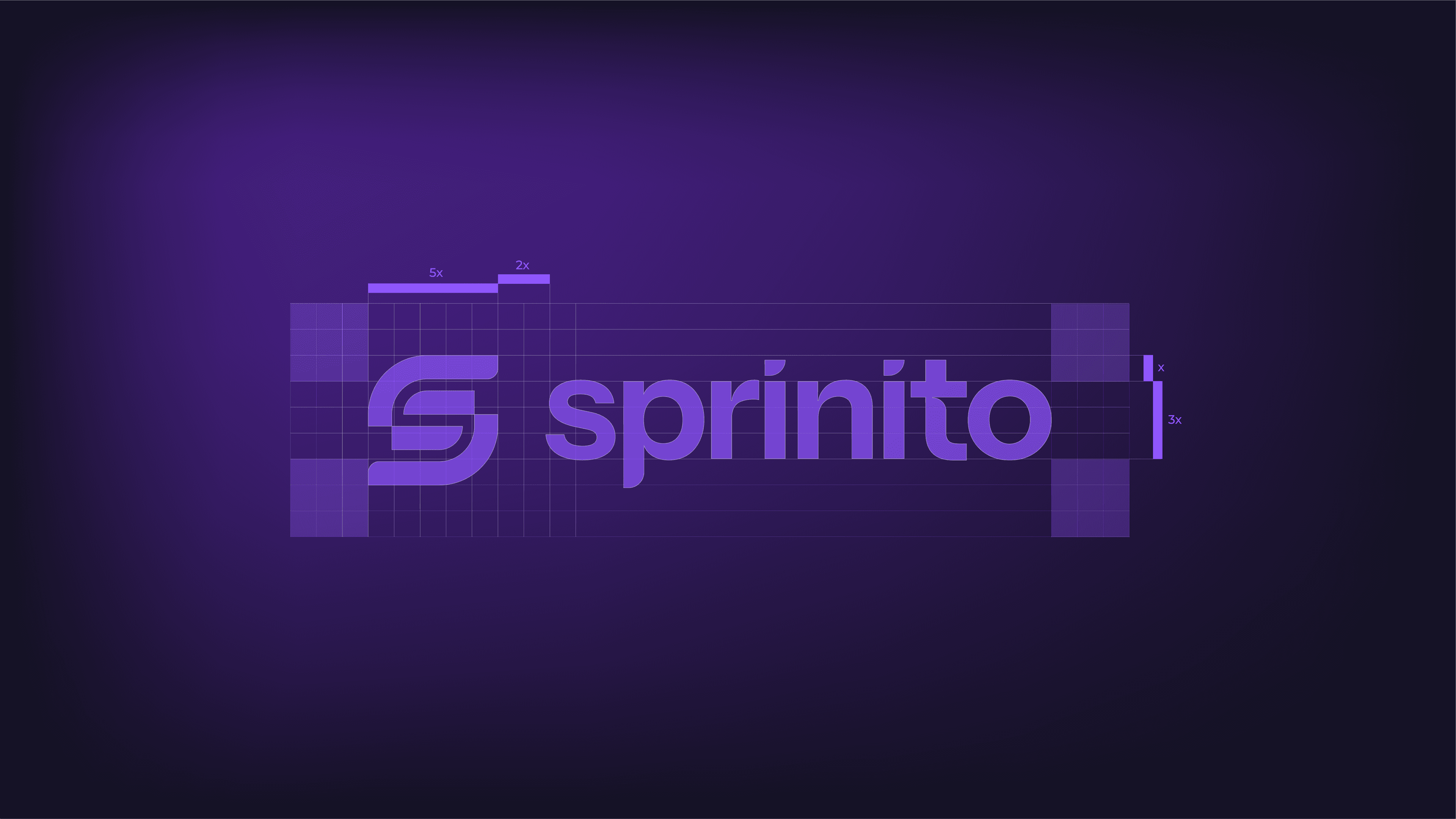
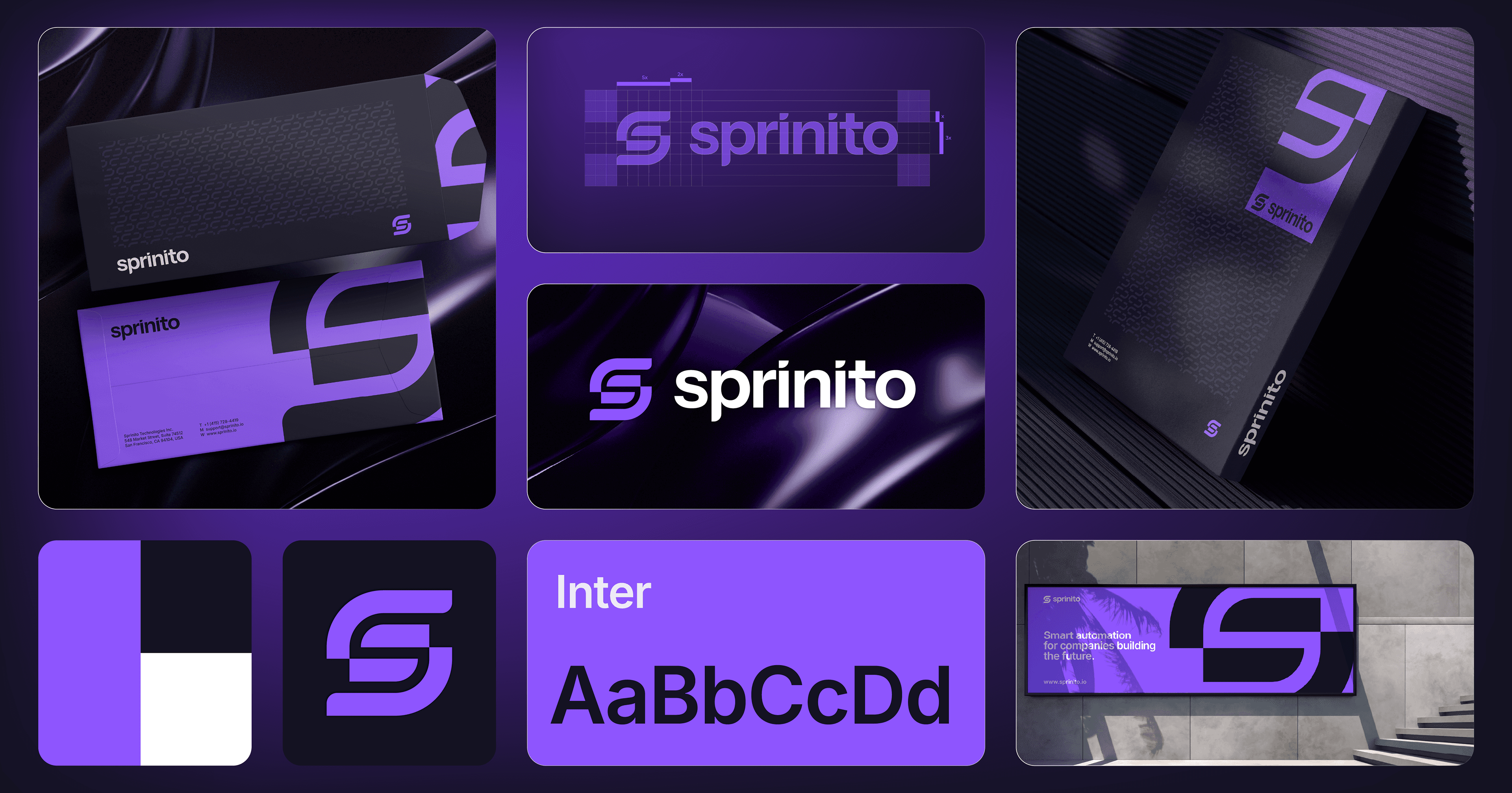
Sprinito is a modern technology company focused on AI-powered workflow automation and digital infrastructure. The project included the development of a complete brand identity and branding system, centered around a distinctive "S" monogram that forms the foundation of the visual language.

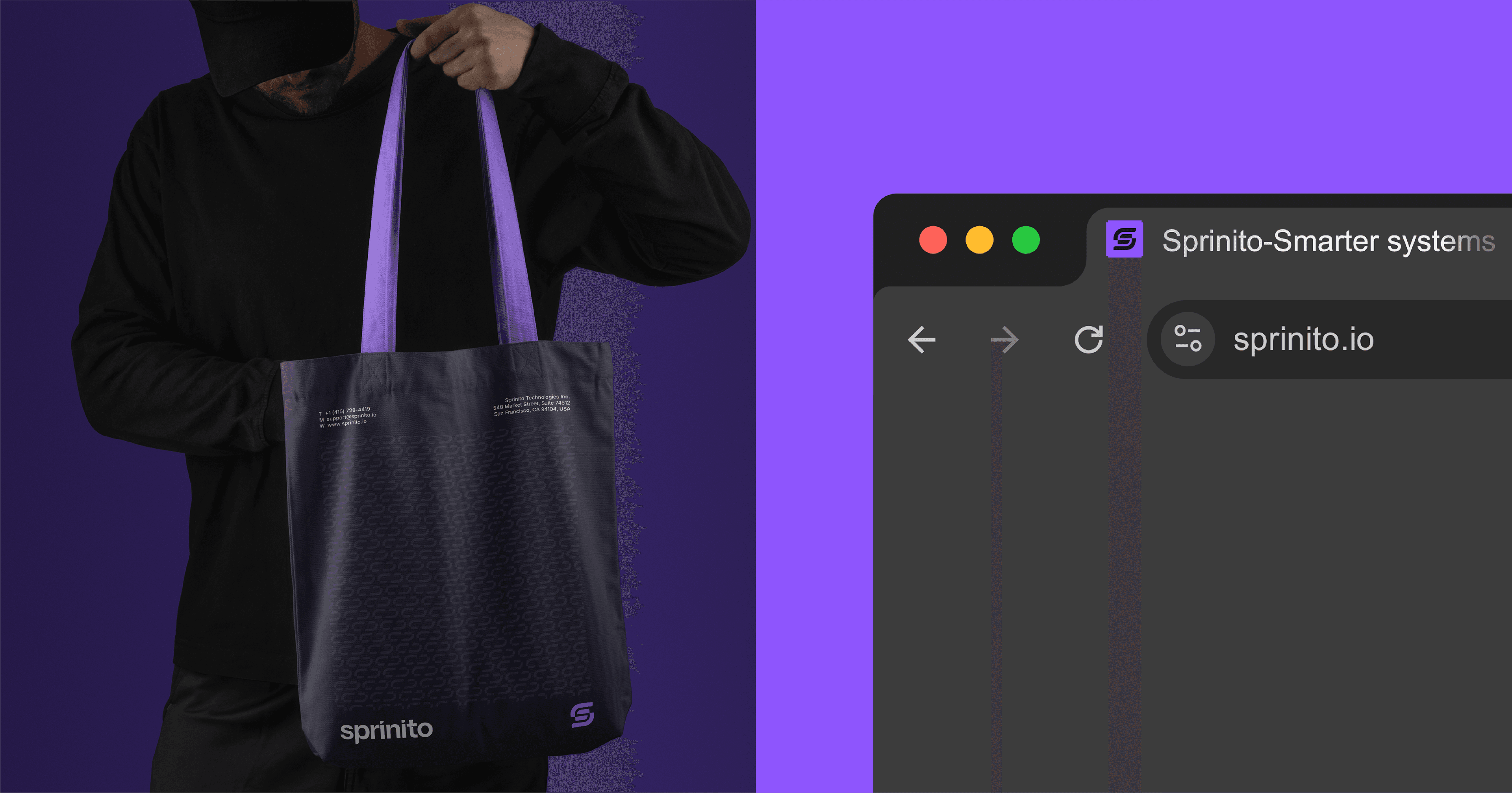
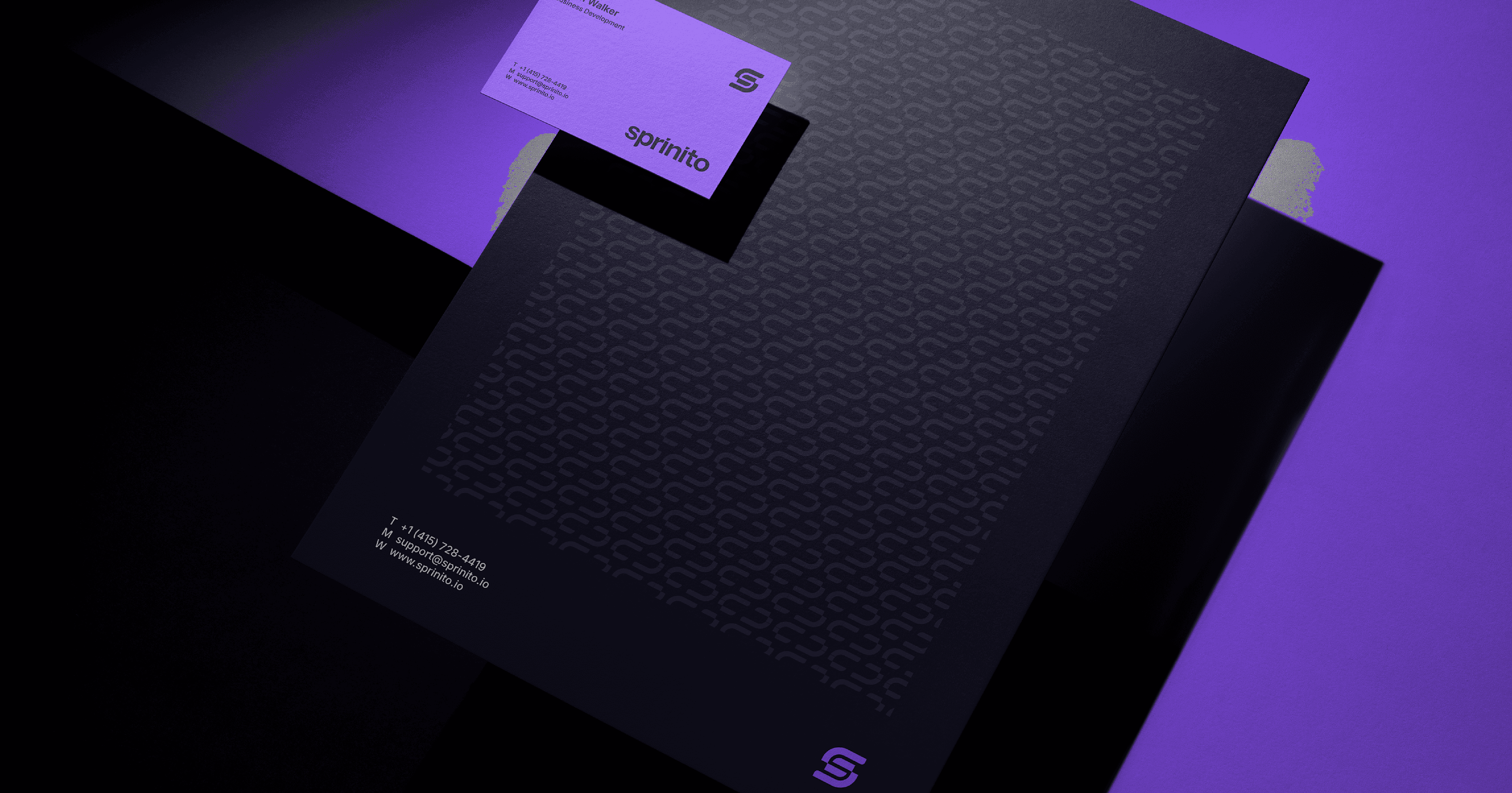
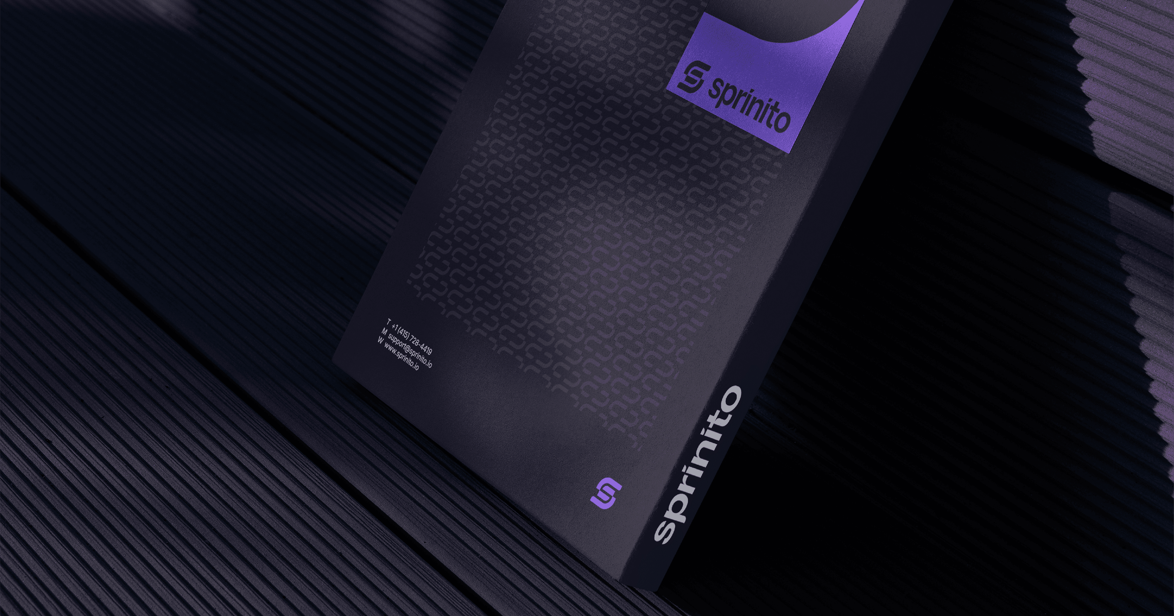
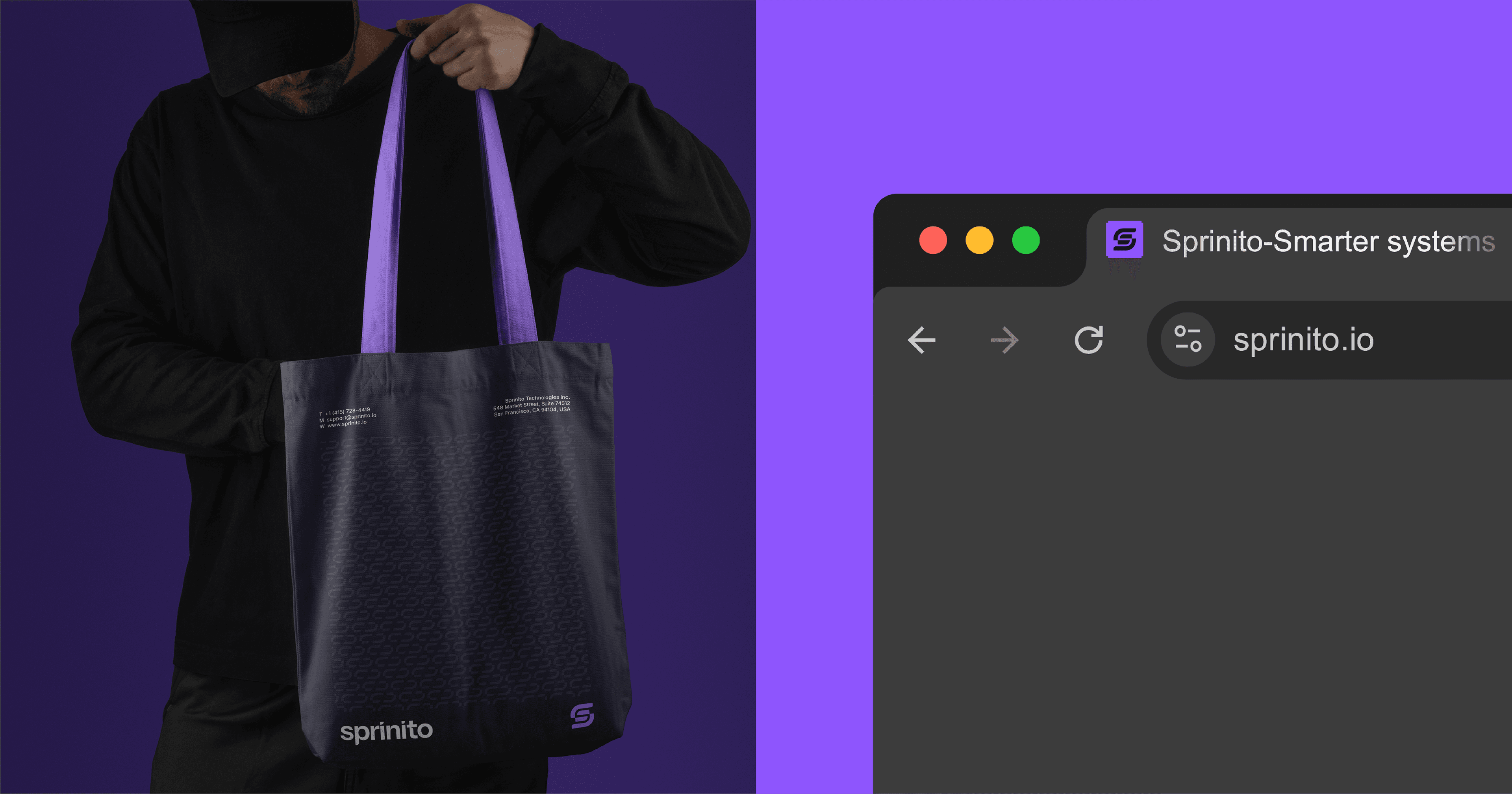
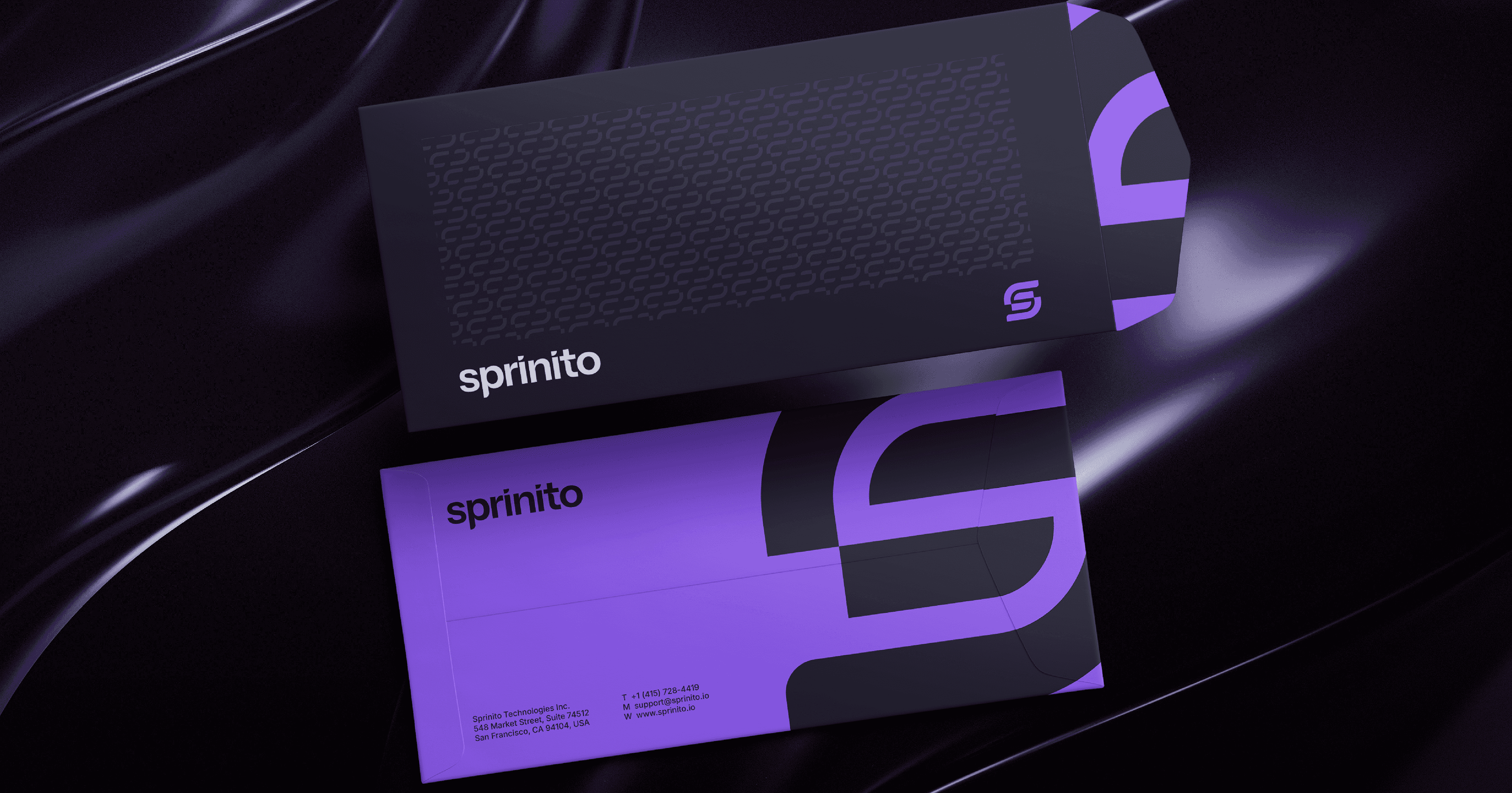
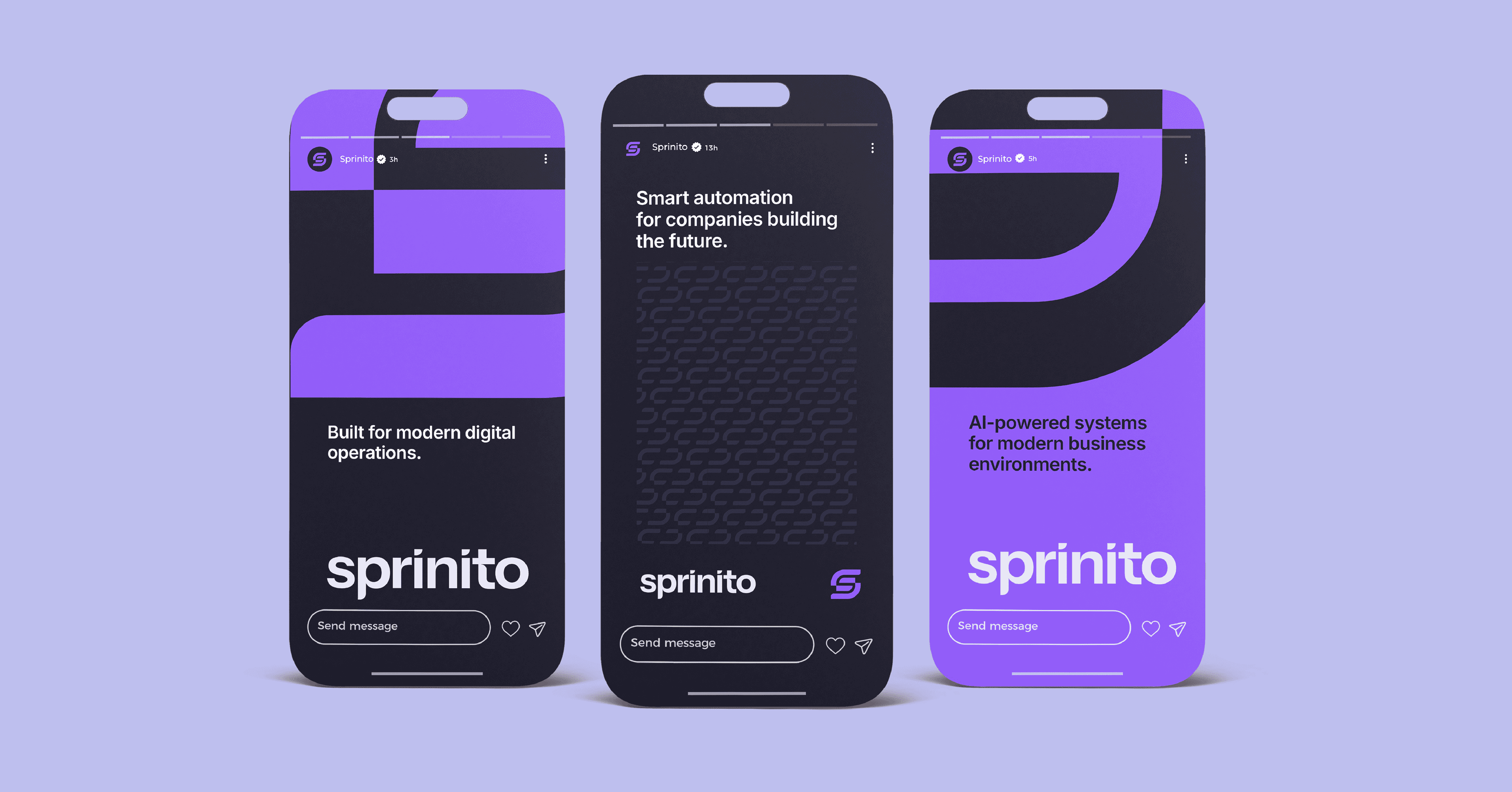
The identity was designed to be clean, scalable, and consistent across every brand touchpoint. The scope of work included logo design, brand identity, visual identity, typography, color palette, brand guidelines, stationery design, business cards, corporate documents, social media design, marketing materials, print design, outdoor advertising, merchandise, presentation assets, website graphics, brand applications, mockups, and a complete visual system for digital and print communication.


Sprinito is a modern technology company specializing in workflow automation and digital solutions for growing businesses. The project included the development of a complete brand identity, built around a clean and distinctive "S" monogram that serves as the core of the visual system. A bold violet color palette was chosen to create a strong, recognizable presence while reflecting innovation and a forward-thinking approach. The identity was designed to remain consistent across every brand touchpoint, including logo design, typography, stationery, social media, marketing materials, merchandise, outdoor advertising, and print applications, ensuring a cohesive and scalable brand experience.