Nader Tohamy

Brand Identity

NT is the personal leadership brand of Nader Tohamy — a Canadian real estate advisor, educator and advocate for ethical Islamic finance.

Nader Tohamy personal brand logo with a sage NT monogram and white serif wordmark on a dark rippled background.

The objective was to create a visual identity that communicates trust, integrity and professionalism without relying on predictable real estate symbols or religious clichés.

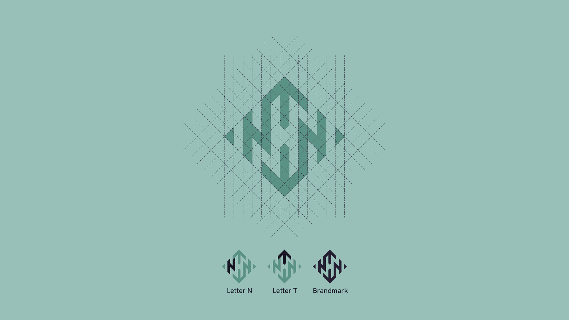
Instead of designing another generic realtor logo, the focus was placed on building a timeless monogram capable of representing a person, a philosophy and a long-term leadership platform.

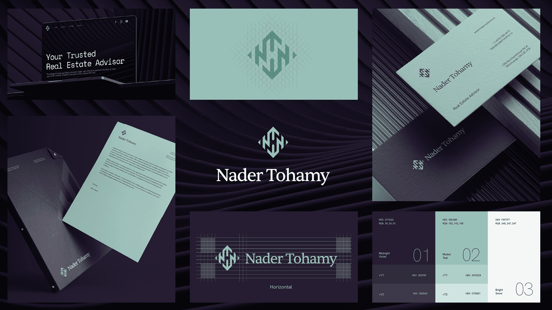
Nader Tohamy brand palette showing dark purple, sage and white primary colours with supporting accent swatches.
Nader Tohamy typography system pairing Space Mono and Hanken Grotesk on sage and dark purple backgrounds.

NT is the personal brand of Nader Tohamy, a Canadian real estate advisor and Islamic finance educator.

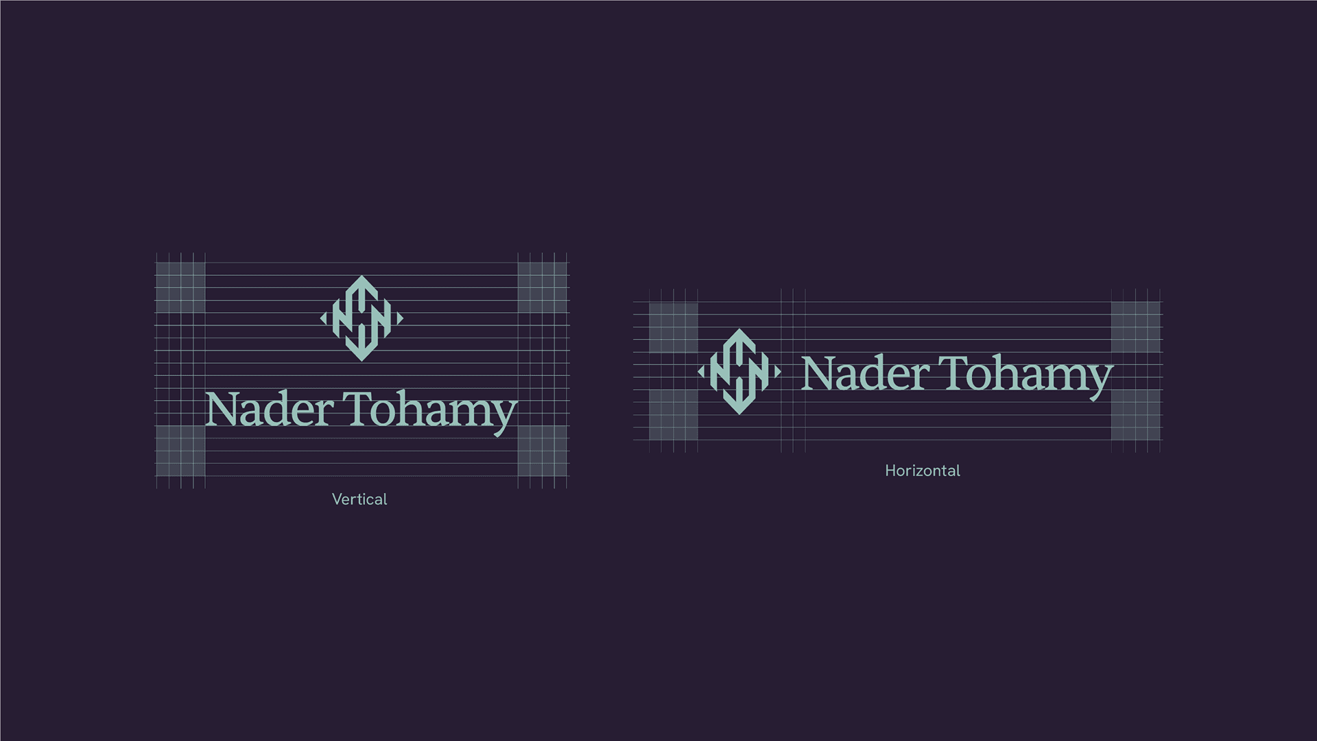
The identity is centered around a custom NT monogram built on a precise geometric grid. The symbol is rotationally balanced and remains recognizable when rotated 180°, allowing it to be perceived consistently from different orientations.

The result is a modern, recognizable, and flexible brand identity that helps Sprinito maintain a consistent presence across web, social media, print, advertising, and corporate communications while supporting future

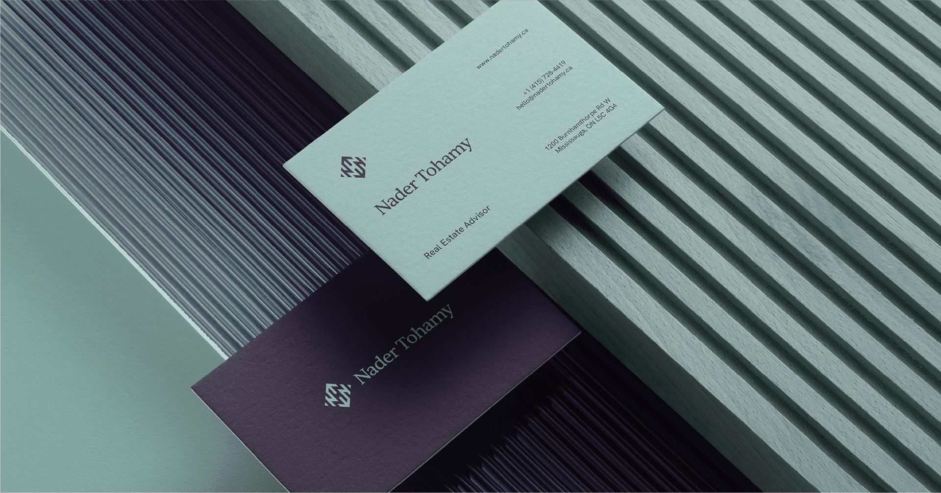
Nader Tohamy business card mockup in sage green and dark purple on a ribbed surface.

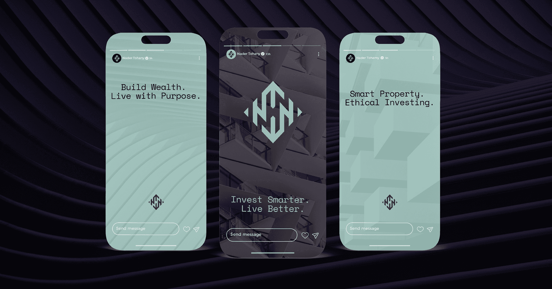
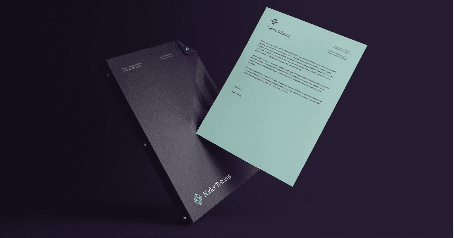
The project included logo design, color palette, typography, brand identity system, brand guidelines, stationery, social media assets, website direction, outdoor signage and print applications, creating a timeless and cohesive visual identity.

EXPLORE
MORE PROJECTS