ParkWise
Brand Identity
ParkWise specializes in commercial parking lot maintenance, ensuring cleanliness, an appealing appearance, and organization across properties.

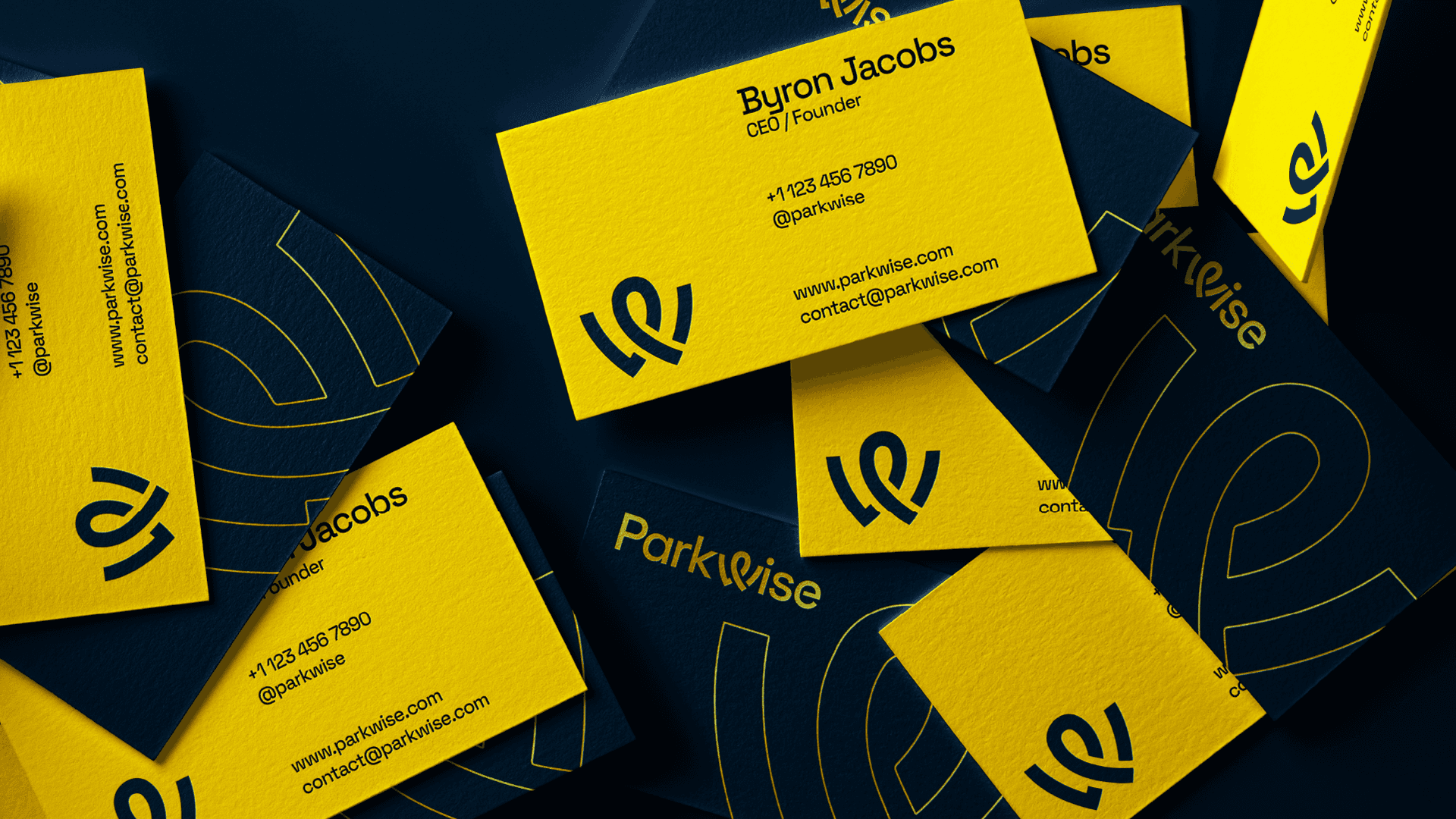
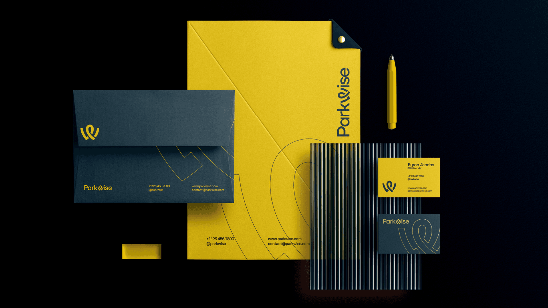
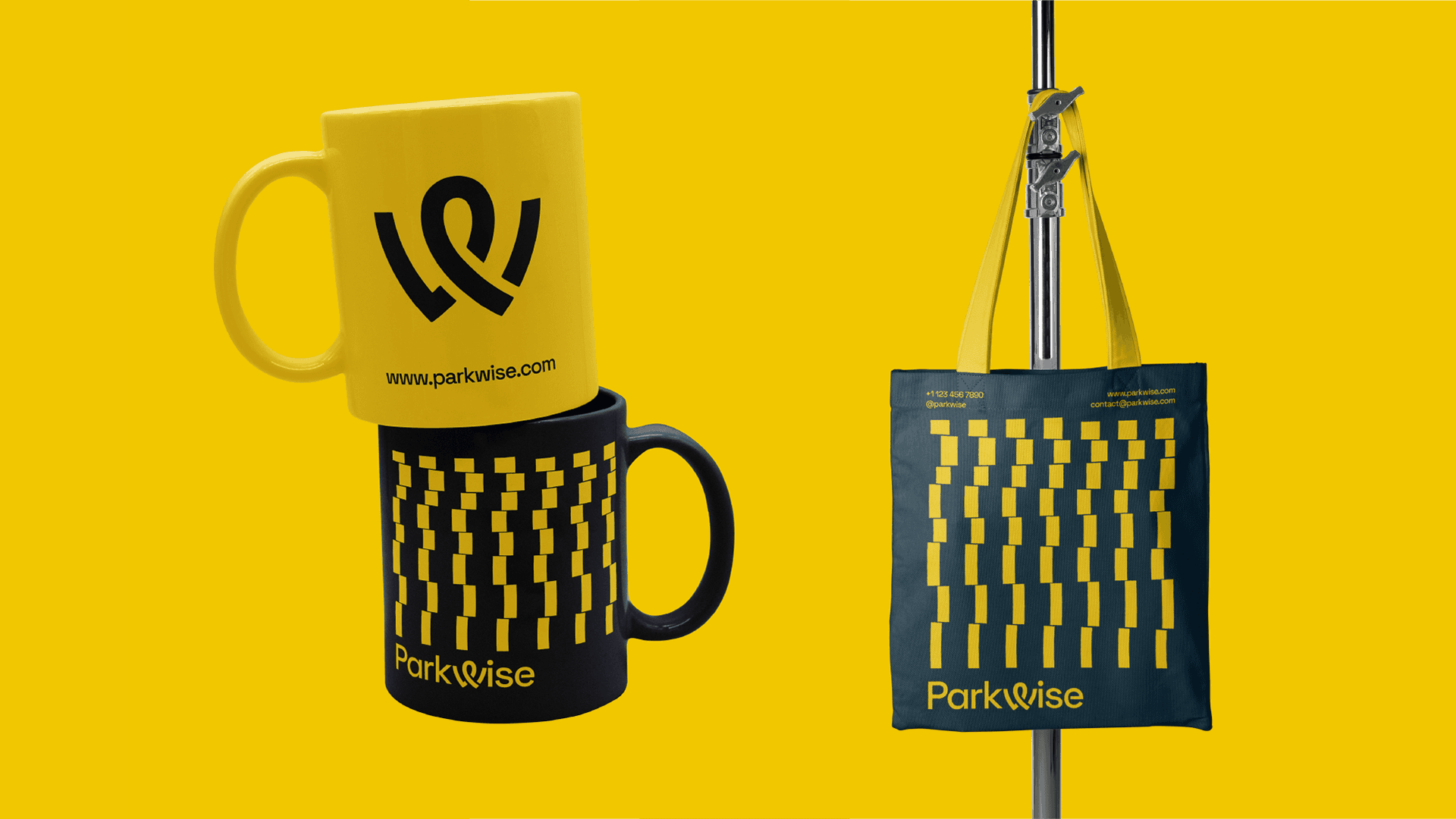
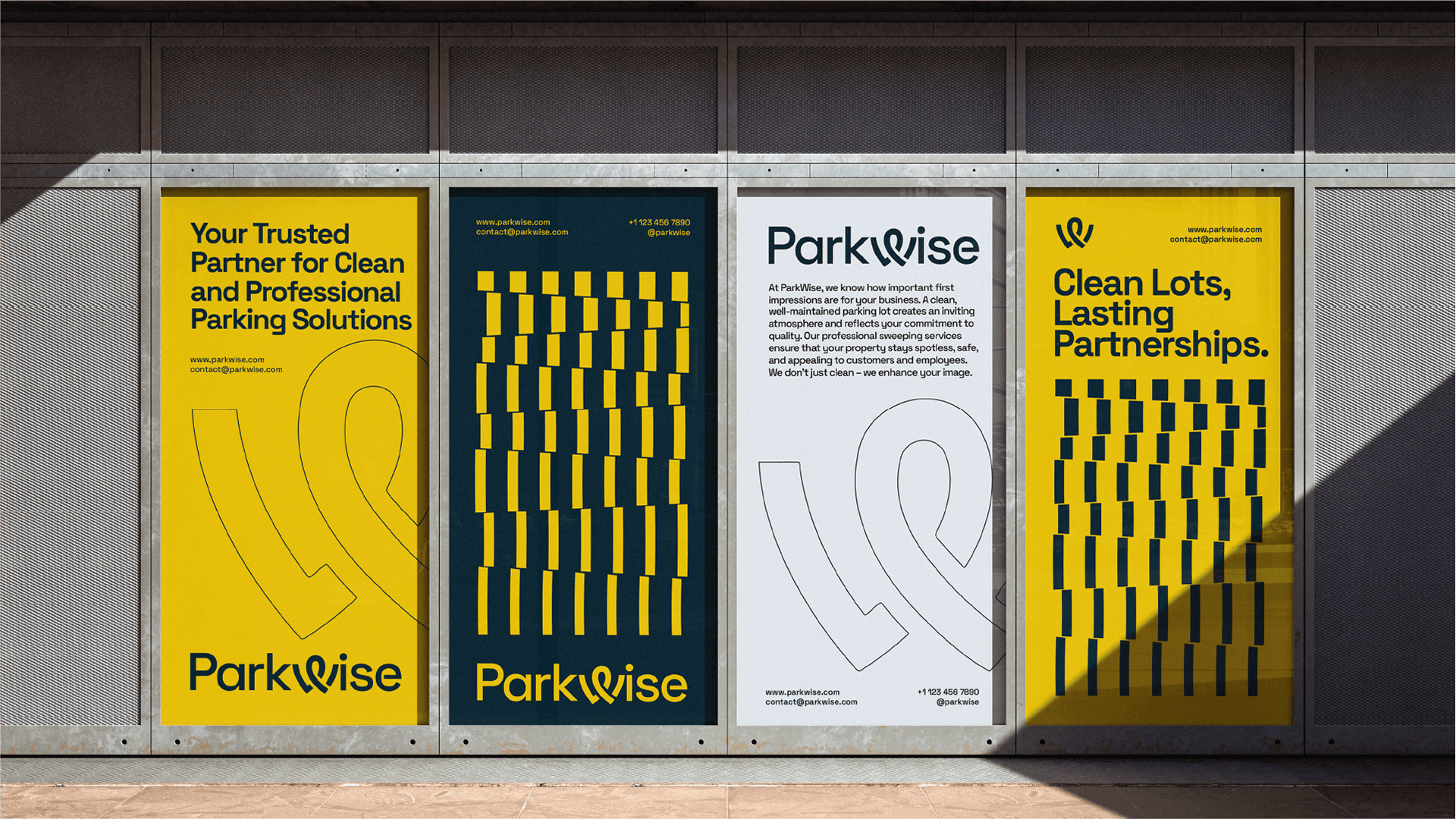
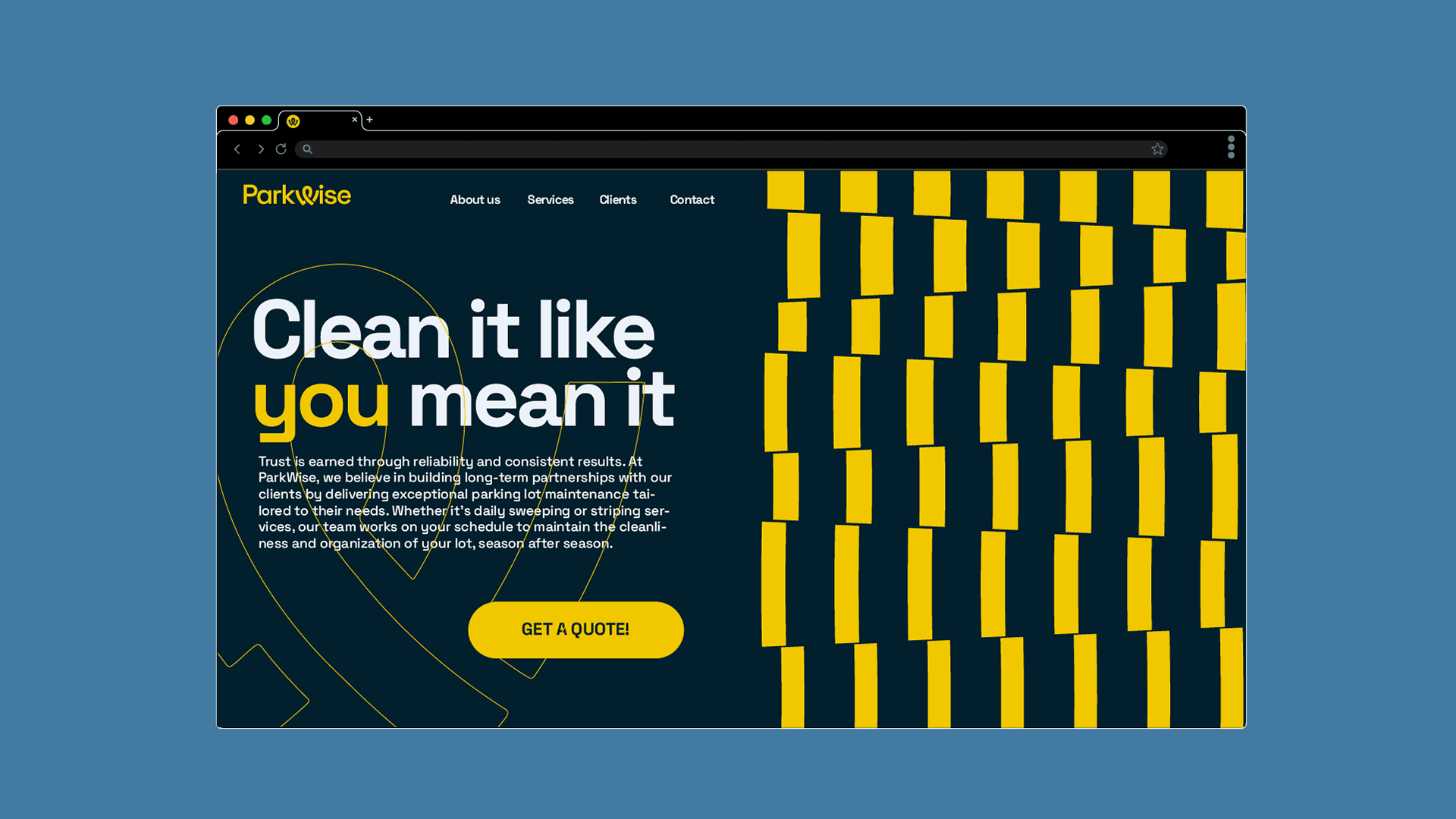
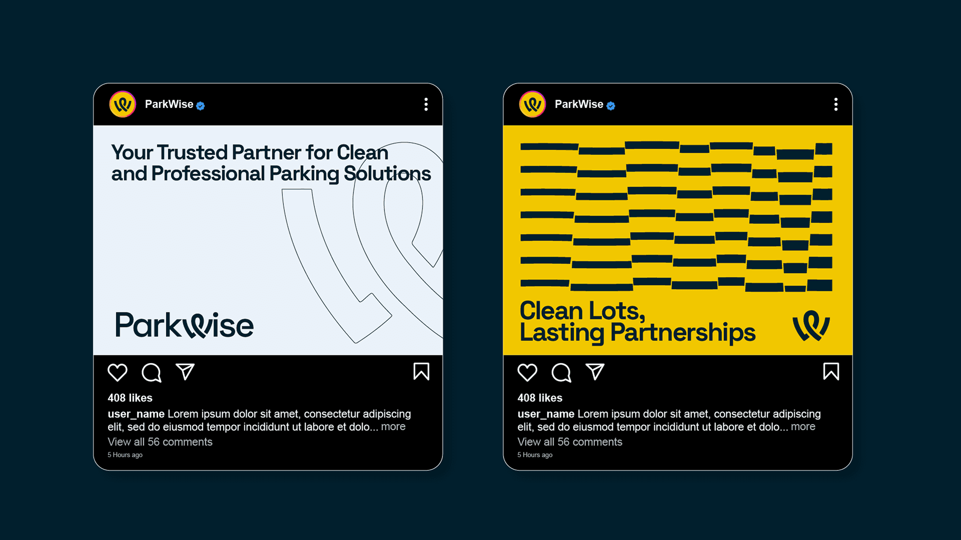
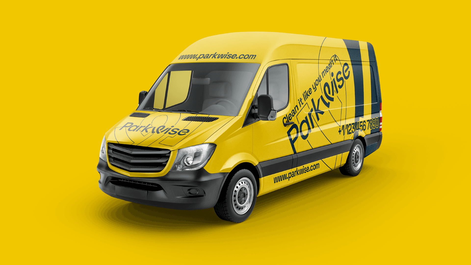
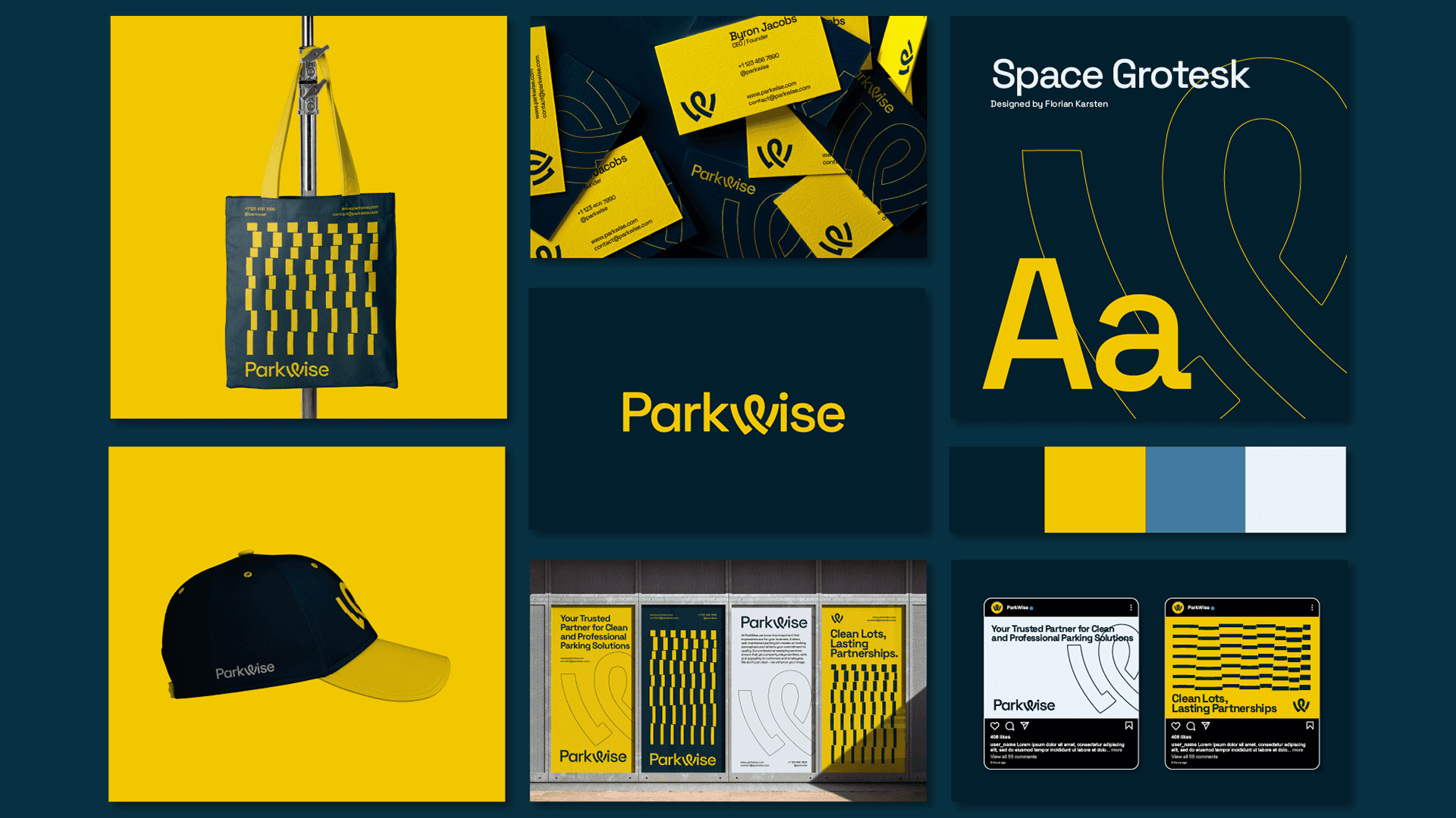
The task was to create a modern and professional visual identity that reflects the cleanliness, order, and high level of service provided by ParkWise. The brand concept is built on clean lines and precise typography, symbolizing the company’s attention to detail and reliability. As part of the project, a logo, color palette, and fonts were developed, along with business cards, folders, envelopes, branded merchandise, posters, social media designs, a corporate website, and branded vehicle design.